
Let’s be honest for a second. Logging into most cryptocurrency exchanges usually feels like you’ve accidentally stumbled into the cockpit of a commercial airliner. For someone who just wants to swap some tokens without a headache, it’s completely overwhelming.
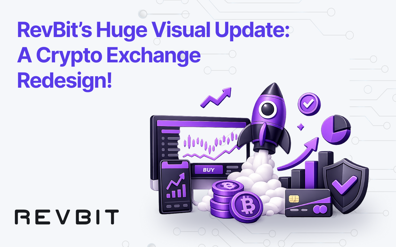
That’s exactly why we decided it was time for a change. Our team recently rolled out a major user interface update, and frankly, we are incredibly proud of it. We decided to scrap the intimidating “wall of numbers” aesthetic for something clean, modern, and highly intuitive.
Let’s talk about the actual design choices. The entire platform now defaults to a rich, premium glass style. We are talking deep, true whites/blacks offset by electric, neon purple and violet highlights. It gives off a very futuristic, high-end fintech vibe that’s super easy on the eyes, especially if you’re trading late at night.
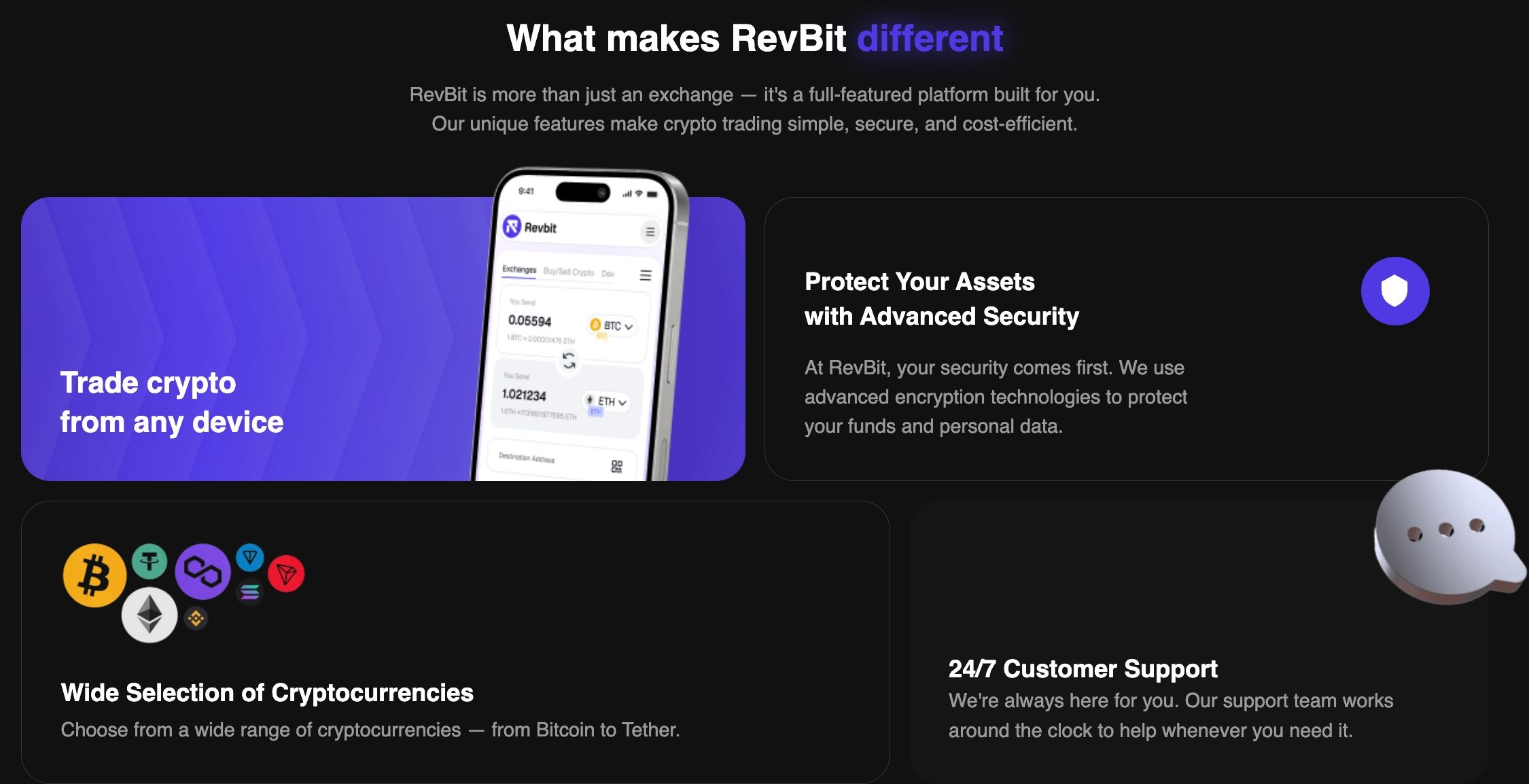
But the real stars of the show are the custom graphics. Instead of relying on the same flat, boring vector art that 90% of the industry uses, we integrated these gorgeous 3D, glassmorphic icons. Whether it’s a glowing purple flame emphasizing our “Fast crypto exchange” claim, a sleek stopwatch highlighting our transaction speeds, or a vibrant 3D refresh arrow in the tutorial section, these little details give the platform a highly polished, tactile feel. It just looks expensive, but in the best way possible.
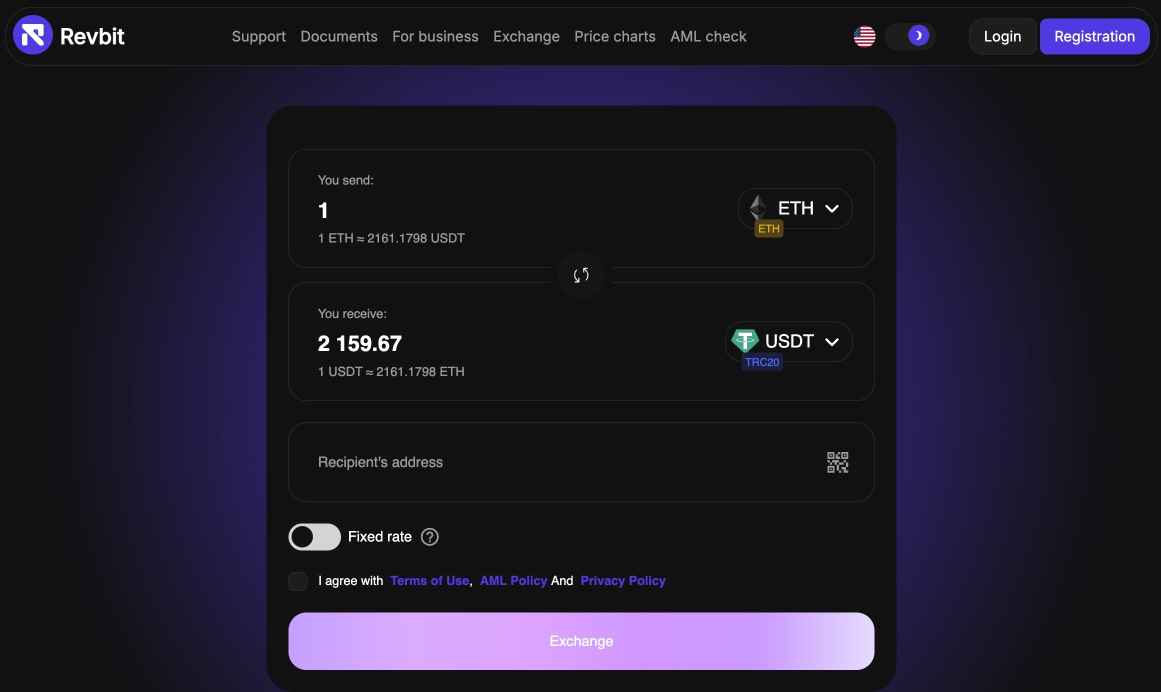
When you actually sit down to use it, the core swap mechanic is sitting right there, front and center. It is ridiculously straightforward. Looking at the main terminal, you see a clean, distraction-free widget. For example, swapping Ethereum (ETH) for Tether (USDT). There is no clutter and no nonsense. One specific feature our team really loves is the subtle toggle switch right above the exchange amount. It lets you easily flip between floating and fixed exchange rates depending on how volatile the market is acting that day.
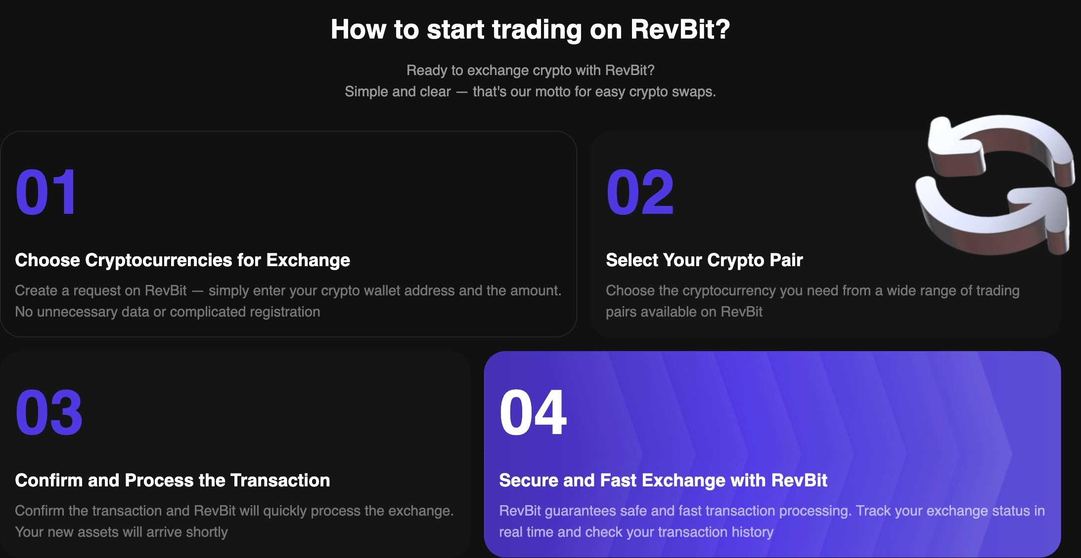
We even broke the whole exchange process down into four easy steps on the homepage: choose your crypto pair, enter your receiving details, confirm the processing, and secure your funds. It’s laid out so simply that a total beginner could figure it out in seconds.
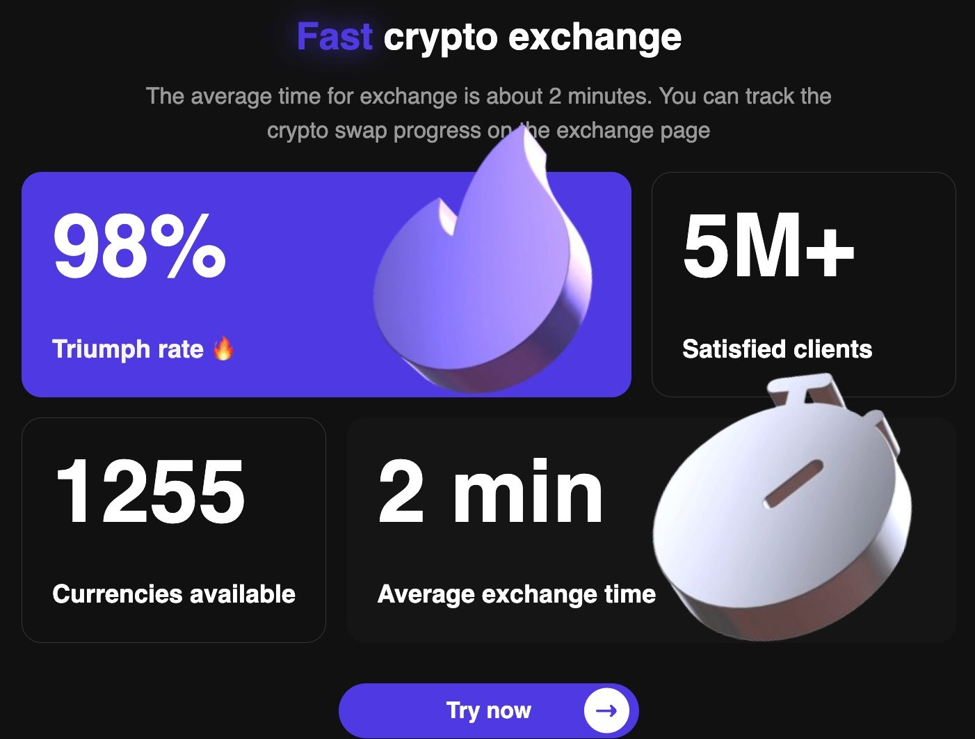
Of course, a flashy UI doesn’t mean anything if the platform doesn’t actually work. We know this better than anyone, so we placed our performance stats right below the main fold to build immediate trust. And honestly, the numbers we are flexing are hard to ignore. We boast a lightning-fast average exchange time of just two minutes, a 98% triumph (success) rate, and an absolutely massive user base of over 5 million satisfied clients!
On top of that, we currently offer access to a staggering 1,255 different currencies! So, whether you are just trying to swap some standard Bitcoin or you’re hunting down a highly specific, low-cap altcoin, we have pretty much got you covered.
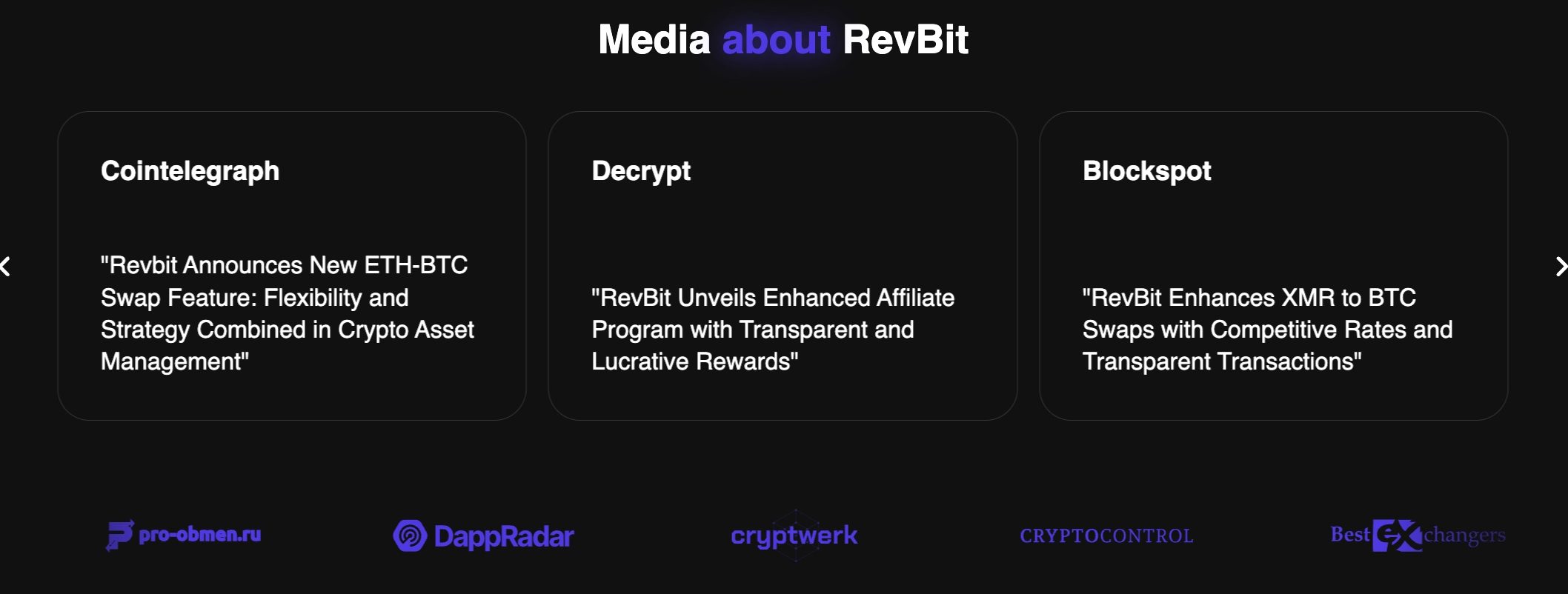
The new design also goes out of its way to prove its legitimacy without feeling desperate. Scroll down a bit, and you’re greeted by a clean banner showing our media mentions from heavy hitters in the space like Cointelegraph, Decrypt, Blockspot, DappRadar & more. Beside that, a really slick mobile mockup proves that our cross-device trading is just as pretty on a smartphone screen as it is on a desktop monitor. Add in our bold promises of advanced security and 24/7 customer support, represented by a neat little chat bubble icon. It’s obvious we want you to feel totally safe leaving your transactions in our hands.
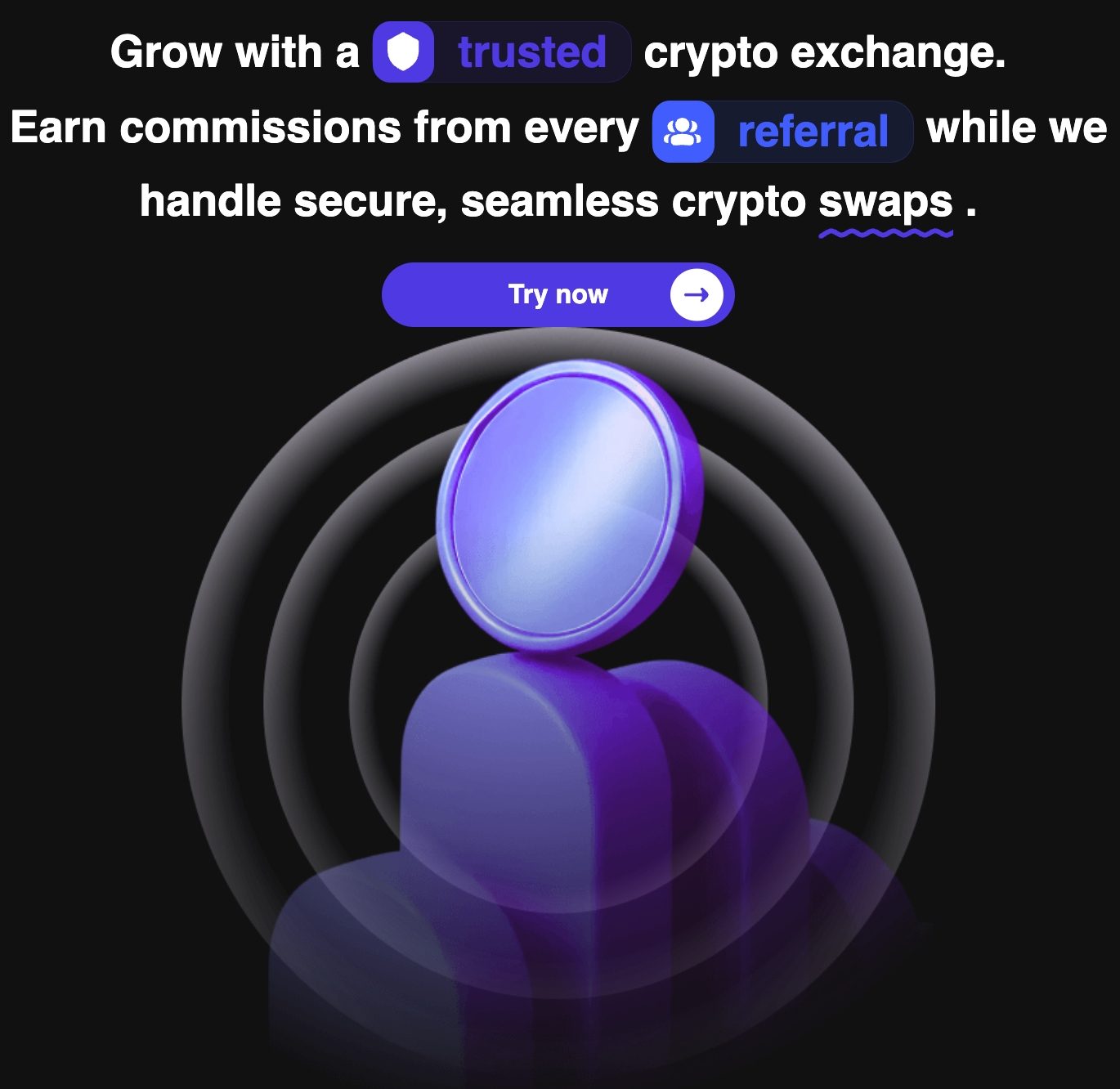
We even gave our affiliate page a facelift. There is a dedicated section featuring a slick, 3D purple coin-and-user icon urging traders to “Grow with a trusted crypto exchange” by earning commissions from referrals. It ties our whole ecosystem together nicely.
Ultimately, we feel our visual update is a massive win. It’s fast, it’s visually striking, and most importantly: it gets out of your way so you can just trade. If you haven’t checked out RevBit lately, the new coat of paint is definitely worth a look!